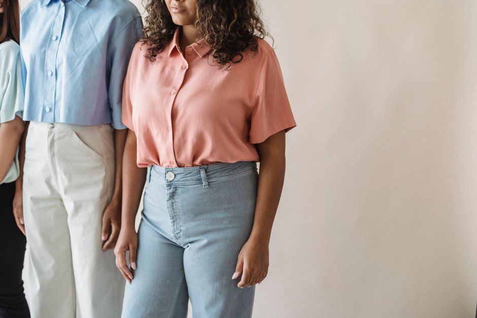
Start with one pastel anchor, then add structure
The most polished pastel outfits use one soft color as the focus and let shape, texture, and contrast do the serious work. Wearing several pale shades at once can look elegant, but only when the outfit has enough definition. The goal is not to make pastel colors look darker. The goal is to keep the outfit from looking flat, overly sweet, or suited only to a warm afternoon.
Choose a dominant color before getting dressed
Pick one main pastel first: powder blue, pale lilac, soft pistachio, butter yellow, peach, blush, or muted mint. Let that color take up roughly half of the visible outfit. Use a cream, navy, charcoal, brown, or denim piece to ground it. This simple ratio gives the eye a clear place to land.
For example, a powder-blue shirt can sit above charcoal trousers and a cream layer. A pale lilac skirt can work with a white knit and dark brown shoes. The outfit stays light without losing visual weight. If the pastel item has a loose shape, pair it with something sharper. A relaxed pastel cardigan needs a straight trouser, a firm shoulder, or a clean shoe to keep the line intentional.
Use tailoring and texture to replace visual intensity
Pastel colors have low contrast, so fabric and fit matter more than they do with black, white, or saturated jewel tones. Look for crisp cotton, smooth wool, ribbed knits, washed denim, matte satin, or substantial linen. Mixing two textures creates depth even when the colors remain close.
Structure also changes the message. A fitted pastel jacket feels composed. A soft pastel sweatshirt feels casual. A long pale skirt with a tucked-in shirt creates a clean vertical line, while a cropped jacket gives the waist more definition. Avoid pairing every soft color with a soft shape. That combination often creates the childish effect people are trying to avoid. For grown-up pastel dressing, start with one gentle color and add at least one firm line, polished finish, or darker neutral.
Match pastel colors with the right neutral
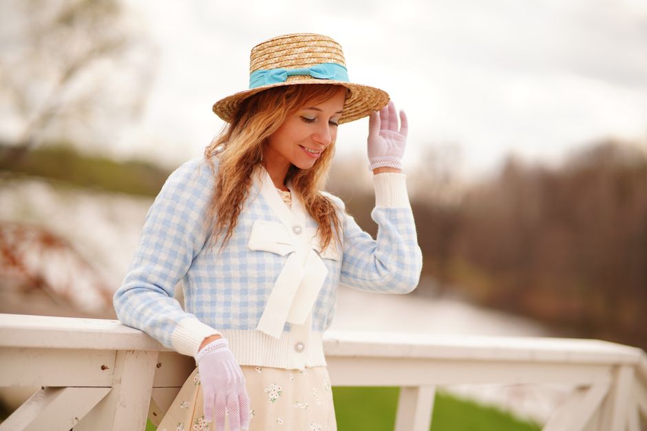
Pastel styling becomes easier when the neutral is chosen for the mood you want. Black creates the strongest contrast, but it can make a pale shade look sharper than intended. Cream keeps the outfit warm and quiet. Navy gives pastel blue, green, and yellow more depth without the severity of black. Brown works especially well with peach, pink, lavender, and butter yellow because it adds warmth.
| Pastel focus | Best grounding neutral | Style effect |
|---|---|---|
| Powder blue | Navy, charcoal, or cream | Clean, calm, and tailored |
| Pale lilac | Chocolate brown, gray, or white | Modern and slightly artistic |
| Butter yellow | Denim, espresso, or ivory | Warm and relaxed |
| Soft pink | Stone, navy, or dark brown | Feminine without looking sugary |
| Muted mint | White, camel, or deep green | Fresh with a grounded finish |
These pairings work because they control contrast. A pale shade next to ivory creates a gentle, nearly tonal outfit. The same shade next to navy looks more deliberate and urban. Neither choice is better in every setting, but each gives a clear result.
Use denim when the outfit feels too precious
Denim is the fastest way to make pastel pieces feel practical. A pastel blouse with straight-leg denim looks relaxed but still planned. A pale knit over a denim skirt has enough everyday texture to avoid looking costume-like. Choose a clean denim shape rather than several distressed details, which can compete with the softness of the color.
Choose warm neutrals for a softer adult finish
Stone, taupe, camel, espresso, and cream make pastels feel richer. They are especially useful for autumn outfits or workwear because they reduce the spring-only impression of pale color. A pale yellow top with espresso trousers is more grounded than the same top with bright white. A lavender layer with taupe creates a calm, muted palette that looks refined in photographs and in person.
Five outfit formulas that work without looking childish
Use these formulas as starting points, then change the color or fabric to suit the weather and setting. Each one keeps the pastel element visible while adding enough contrast to make the outfit feel finished.
- Pastel shirt plus dark straight trousers: Tuck a pale blue, green, or pink shirt into charcoal, navy, or brown trousers. Add a narrow belt and a structured layer if the outfit needs more authority. This is the strongest formula for an office, presentation, or dinner where a soft color still needs to look capable.
- Pastel knit plus white or cream column: Wear a soft lavender or mint knit over a cream top and cream trousers or a long skirt. Keep the silhouettes simple. The column underneath creates length, while the pastel layer adds interest without breaking the line.
- Pastel skirt plus an earthy top: Balance a pale skirt with olive, brown, gray, or navy above it. A fitted or tucked top keeps the waist visible. This works when a full pastel outfit feels too delicate but a single pastel accessory feels too small.
- Two related pastels plus one dark detail: Pair powder blue with pale lilac, or peach with butter yellow. Add one dark element, such as a belt, shoe, bag, or outer layer. Keep the two pastels close in intensity so one does not look accidentally faded beside the other.
- Pastel outer layer over a neutral base: Build the outfit in black, cream, gray, denim, or brown, then add a pastel coat, cardigan, overshirt, or blazer. This is the easiest formula for someone who likes color but does not want to redesign an entire wardrobe.
The best formula for a polished first attempt is the pastel shirt with dark straight trousers. It gives the color enough space to show while the trouser line keeps the outfit adult and useful.
What makes pastel outfits look washed out or too young?
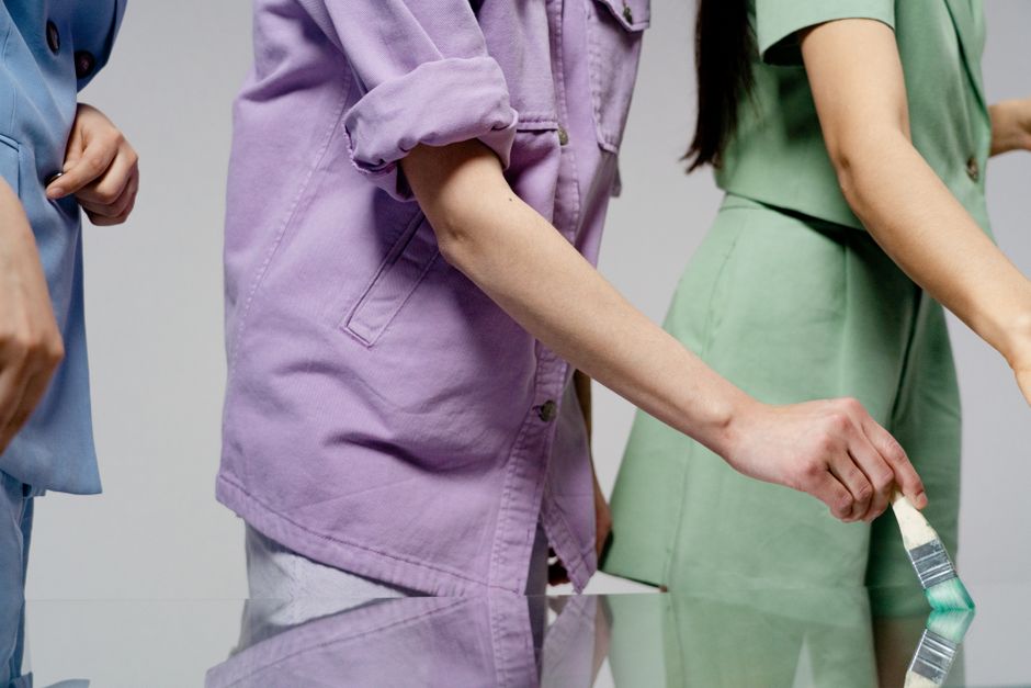
Why does the outfit look flat?
A pale outfit can lose shape when every piece has the same light value. Add contrast through texture, a visible waist, a darker shoe, or a defined shoulder. You do not need a bold print. A ribbed knit beside smooth cotton can be enough. Steaming or pressing the main garment also matters because wrinkles create visual noise around an already quiet color.
Why does the outfit look too sweet?
The usual cause is a pileup of delicate signals: pastel color, rounded shapes, tiny details, glossy fabric, and decorative accessories. Remove two of them. Keep the color, but switch to a straight trouser and a matte texture. Or keep the soft skirt, but add a crisp shirt and simple jewelry. A pastel shade becomes more versatile when the rest of the outfit does not repeat the same message.
When should you skip pastel?
Skip a full pastel outfit when the dress code demands strong authority, when the fabric looks thin or translucent, or when the colors fight your natural contrast level instead of supporting it. Choose one pastel accent over a neutral base instead. If pale shades make you look tired, place the color below the waist or use it in a layer that can be removed. The best styling choice is the one that makes you look clear and comfortable, not the one that uses the most color.
Build a grown-up pastel wardrobe with a simple color rule
Use the pastel as the visual point, the neutral as the support, and the silhouette as the part that makes the outfit feel intentional.
For the most reliable result, begin with powder blue, muted green, or pale lilac rather than choosing several very bright pastels at once. These shades are easy to connect to denim, cream, gray, navy, and brown. Add warm or bright colors later if the first combinations feel natural.
Keep the color rule consistent: one dominant pastel, one grounding neutral, and no more than one extra accent. Check the outfit from a distance. If the color disappears, add contrast. If the outfit looks like a costume, remove one decorative detail or replace one soft piece with a sharper shape.
The clear recommendation is to begin with a pastel shirt, dark straight trousers, and one warm or deep neutral accessory. It is the most flexible formula, gives the color enough presence, and makes pastel dressing feel polished from the first outfit.
