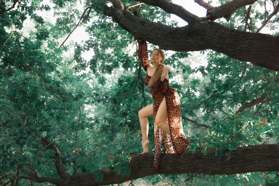
Animal print works best when the outfit has a clear visual hierarchy. The print can lead, support, or add a small accent, but it should not compete with every other element at once.
What Makes Animal Print Look Modern Instead of Costume-Like
The modern approach is less about following a trend and more about controlling visual information. Animal patterns already contain movement, contrast, and irregular shapes. When the rest of the outfit adds too many competing details, the result can look theatrical rather than current. The goal is not to make the print disappear. The goal is to give it enough space to look deliberate.
Start with scale, not color
Print scale changes the mood of an outfit before color even enters the discussion. Small leopard spots create a finer, more detailed surface and usually feel easier to wear in daytime outfits. Large spots look bolder because each mark takes up more visual space. Zebra stripes create a sharper effect because the eye follows the direction of the lines. Snake-inspired patterns often appear quieter when the shapes are small and close in tone.
A useful rule is to match print scale to the amount of attention you want. If the print covers most of the garment, a small or medium pattern gives the eye more breathing room. If the print appears only on a narrow area, a larger pattern can make that detail visible instead of fussy.
Use clean shapes around a busy pattern
Simple silhouettes make animal print feel intentional. Straight-leg trousers, a relaxed shirt, a column skirt, a clean jacket, or a basic knit create a stable outline around the irregular pattern. Extra ruffles, dramatic sleeves, several tiers, and heavy decoration all raise the style risk because they add movement in the same visual space.
This does not mean every outfit must look plain. Texture can add depth without creating another loud pattern. Smooth leather, soft knitwear, denim, brushed cotton, and matte tailoring each give the print a different frame. The strongest combination usually pairs one active surface with one or two quiet surfaces.
Modernity comes from contrast control
Older-looking combinations often rely on matching the print with more of the same attitude: high heels, sharp glamour, strong makeup, large jewelry, and a very fitted silhouette. A current outfit can lower that intensity by adding one relaxed element. A structured animal-print skirt feels fresher with a loose shirt and simple flat shoes. A fitted printed top feels less formal with straight denim and an open jacket. A bold coat becomes easier to wear when the base layer uses calm colors and simple lines.
One focal point is the safest starting position. Let the print occupy one major area, then use shape, texture, and color to support it. That formula gives the outfit character without making the pattern carry the entire look.
How to Balance Animal Print With Color and Proportion
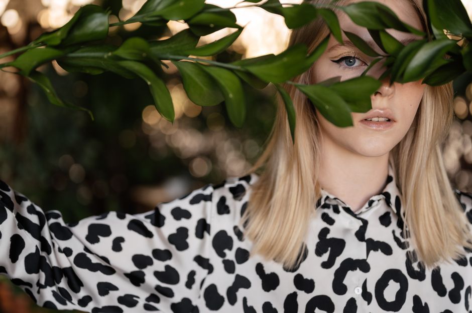
Color balance is more reliable than matching every shade in the print. Most animal patterns already contain a neutral base, so black, cream, white, gray, denim blue, brown, and muted olive can anchor them without creating visual noise. The following guide shows how much contrast each approach introduces.
| Print approach | Supporting colors | Recommended print coverage | Style result |
|---|---|---|---|
| Brown and black leopard | Black, cream, dark denim, warm brown | One large garment or two small accents | Warm, grounded, and easy to repeat |
| Black and white zebra | White, black, gray, denim, red accent | One focal garment with quiet accessories | Graphic and high contrast |
| Muted snake pattern | Stone, taupe, charcoal, soft green | Up to half of the visible outfit | Subtle and textured |
| Bright colored animal print | One repeated color plus a neutral | One statement area | Playful but controlled |
| Mixed animal prints | Shared background color and simple shapes | Two small areas maximum | Intentional only when contrast is limited |
The proportion rule is simple: the louder the print, the less surface area it needs. A high-contrast jacket can lead an outfit even when the rest is plain. A low-contrast skirt can cover more of the look because its pattern reads as texture from a distance. Print intensity also changes with distance. A pattern that seems modest in a mirror may become much stronger in photographs or under bright indoor lighting.
Warm brown in a belt, cream in a knit, or black in a shoe creates a visual bridge. Do not repeat every color. One repeated tone is enough to make the outfit look planned.
The One Rule That Makes Animal Print Easier to Wear
Keep the print complex and the outfit simple. That rule works because animal patterns already supply contrast, rhythm, and personality, so adding another statement layer often reduces clarity; the most dependable combination is one printed garment, one calm base color, and one relaxed or structured shape that changes the mood without fighting the pattern, while accessories should repeat a neutral from the print rather than introduce a new theme, and the final test is practical: if the eye moves first to the print, then to the face, then to the overall silhouette, the outfit has a clear order, but if the eye jumps between shoes, jewelry, bag, neckline, and pattern, remove one noticeable element before leaving the house.
Five Steps to Build a Modern Animal Print Outfit
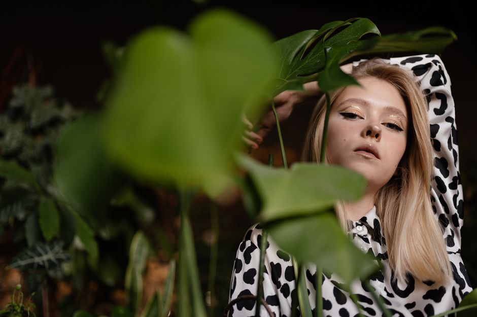
Use this sequence when the pattern looks attractive on its own but difficult to place in a complete outfit.
- Choose the role of the print. Decide if it will be the main event, a supporting layer, or a small accent. A printed skirt or coat acts as the main event. A shirt under a jacket supports the outfit. A scarf, shoe, belt, or small bag acts as an accent. Do not assign two items the same leading role.
- Set the silhouette before adding accessories. Choose the outline first: fitted top with wide trousers, loose shirt with a straight skirt, short jacket with a longer base layer, or relaxed dress with a defined waist. Animal print looks more polished when the body line is easy to read. If the print is oversized, avoid hiding its shape under several loose layers.
- Limit the palette to three main colors. Count the print background as one color, then add one neutral and one optional accent. A brown-and-black pattern, cream base, and dark denim already create enough range. A fourth strong color can work, but it should appear in a very small area, such as a narrow stripe or a single accessory.
- Offset the print with a different texture. Pair a smooth pattern with soft knitwear, worn denim, brushed cotton, or matte tailoring. Texture creates depth without asking the eye to decode another graphic. Avoid stacking several shiny surfaces with a high-contrast print because reflected light makes the whole outfit look busier.
- Run a movement and distance check. Walk, sit, raise your arms, and view the outfit from several steps away. A pattern that twists across a waistband or pulls across the chest may look uneven in motion. Check the outfit in natural light and in a phone photograph. If the print dominates from every distance, reduce the area or remove one accessory.
Why One Animal-Print Piece Usually Wins
The clearest recommendation is to wear one major animal-print piece at a time. This gives the pattern room to look deliberate, keeps the outfit adaptable across settings, and lowers the chance that the look will feel tied to one short trend cycle. A printed blouse, skirt, trouser, jacket, or dress can each lead an outfit when the supporting pieces use simple lines and calm colors.
Two printed elements can work, but the match has to be exact enough to look planned. The patterns should share a background color, a similar level of contrast, or a clear scale relationship. A small spot on a scarf paired with a larger spot on a shoe may work because the two areas are separated and the accessory remains minor. Two large, high-contrast prints placed near the face and hips create a stronger risk of visual competition.
Print mixing is also less forgiving in formal settings. For a workplace, interview, ceremony, or event with an unclear dress code, one restrained animal-print accent is safer than a full printed outfit. A narrow belt, compact scarf, or small shoe detail can add personality while keeping the overall message controlled. For weekends, concerts, and creative settings, a larger piece can carry more of the look because the setting allows stronger visual expression.
There are also clear times not to add animal print. Skip it when the outfit already has a large logo, bold lettering, bright color blocking, or a dramatic silhouette. Skip a second printed item when the first one changes scale dramatically in photographs.
The final verdict is direct: for a polished everyday look, choose one medium-scale animal-print piece, pair it with two quiet colors, and keep the silhouette clean. That combination gives the strongest balance between personality and repeat wear.
